
Blog
Small Details That Make Online Card Games Feel Real

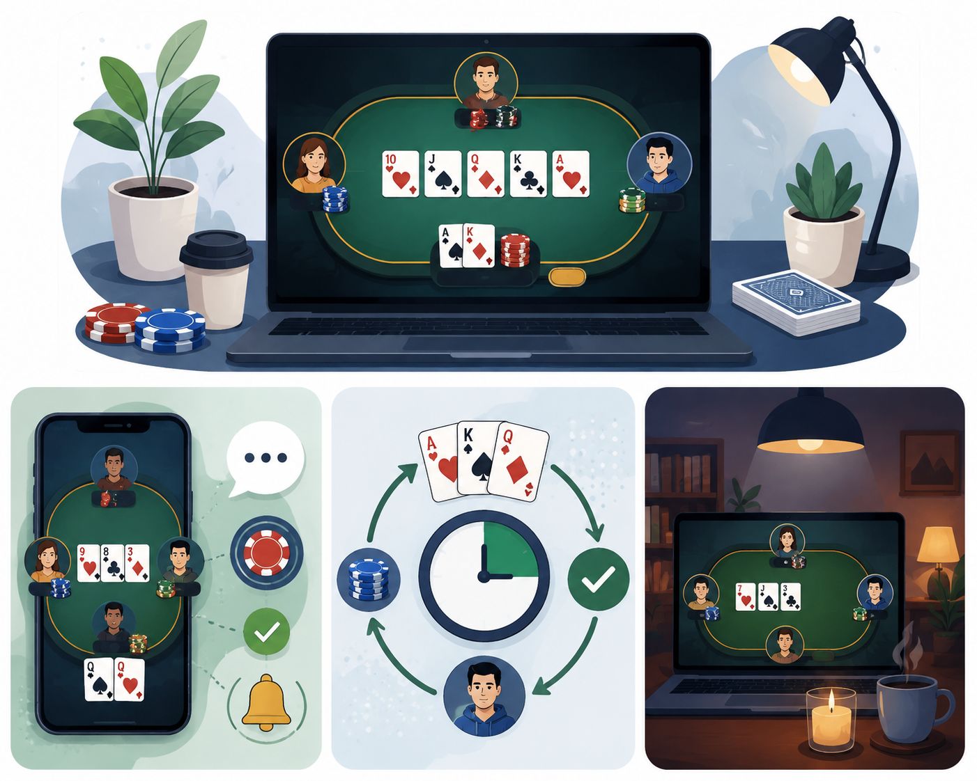
The highest compliment an online card table can receive is silence. Nobody writes a review praising the way the chips settle, or the half-second the dealer waits before turning the next card. Players play, hand after hand, and never once think about the software.
That silence is expensive. It is assembled from dozens of decisions that look trivial in isolation and collectively decide whether a game feels like a table or like a spreadsheet with playing cards printed on it. None of them touch the rules. A banker bet pays the same whether the card slides into position or blinks into existence. What changes is the sensation of the thing, and sensation is most of what people mean when they say a game feels real.
Screen Has To Do The Work The Room Used To Do
A physical casino floor gives away atmosphere for free. Cards make a sound against felt. A dealer’s hands move in a way that telegraphs what comes next—chips clatter. Somebody at third base sighs. Even the dead time between hands feels like part of the game rather than a gap in it, because a room is always doing something.
The room is performing half the design work and charging nothing for it.
A browser tab starts with none of that. Every cue has to be built deliberately, and every cue costs something: bandwidth, load time, attention, screen space. That is the real constraint on digital table design. Not what can be added, but what earns its place.
A Table Is A Place Before It Is A Screen
Classic card games arrive with a mental picture already installed. Players know what a baccarat layout looks like before they open it: the felt, the marked betting boxes, the shoe, the chip tray, the dealer standing where dealers stand. A digital version that ignores those conventions does not read as modern. It reads as thin.
This matters most where the underlying game is standardised. Someone working through a list of top baccarat casinos in Singapore is often comparing mechanically identical tables: the same third-card rules, the same commission on the banker bet, sometimes the same live studio feed sitting behind different branding. When the maths is shared, presentation becomes the whole basis of preference.
And presentation is where the gap opens up. One table keeps the cards large and central, with the running total where the eye already is. Another crowds the same information under oversized buttons, a promotional banner and a decorative border that pulses for no reason. The rules have not changed. The experience has.
The hierarchy that works is not complicated. Cards dominate. Betting areas have visible edges so a player can tell where a chip will land before releasing it. Totals and payouts stay legible without shouting. Background texture supplies atmosphere and then gets out of the way. A real table does not flash when a chip touches it.
Movement Is How A Player Knows Something Happened
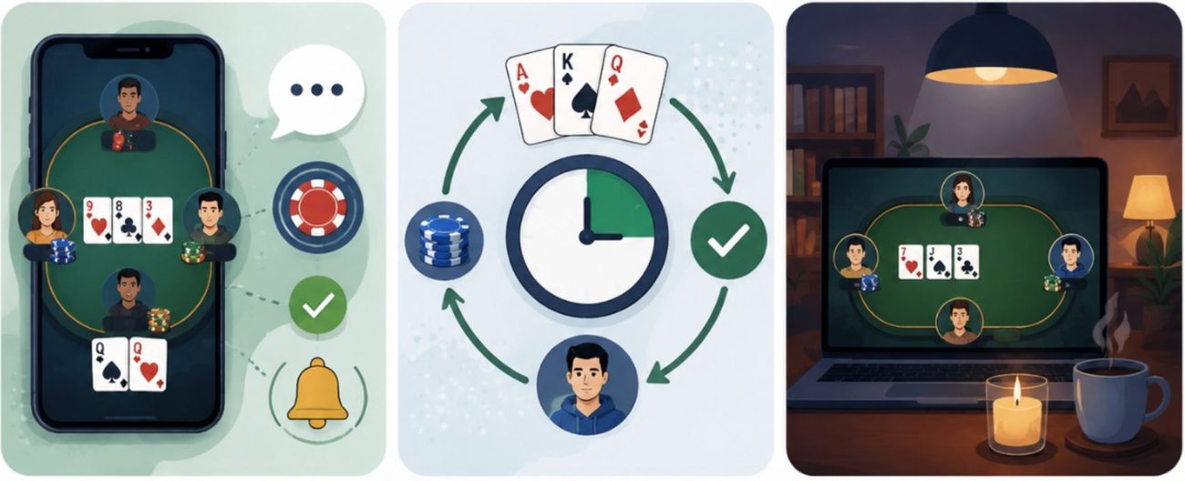
A card that appears is information. A card that travels from the shoe to the hand is an event.
That short journey does something no static update can: it establishes cause. Something was dealt, from somewhere, to someone. The player does not have to reconstruct the sequence from a changed number.
Timing is where this gets decided. Jakob Nielsen’s three response-time limits remain the useful frame here: roughly a tenth of a second registers as instantaneous. In contrast, about one second is the outer edge of uninterrupted thought. A deal animation that lives inside that window reads as part of the game. One that overruns it reads as a wait, no matter how attractive it is.
The same discipline applies to the tap that starts the hand. Google’s Interaction to Next Paint metric treats 200 milliseconds as the threshold for good responsiveness, measuring the delay between an input and the next visual update. On a card table, that number is not an abstraction. It is the difference between a hit button that responds and one the player presses twice.
Chips follow the same logic. A wager that slides into the betting box has weight. A stack that materialises has none. Small variation helps too: cards landing at slightly different angles, chips settling rather than snapping into a grid. Repeated identical motion is one of the fastest ways to make a game feel automated.
Motion is also not free for everyone. Some players get headaches, nausea or worse from movement that most people barely register, which is why operating systems expose a reduced-motion setting. Browsers surface it through the prefers-reduced-motion media query. A well-built table honours it: shorter transitions, cross-fades instead of travel, the sequence preserved without the swoop.
Sound Is The Cheapest Texture In The Room
Audio does an unreasonable amount of work for how little it costs. A quiet shuffle, a card brushing felt, chips touching the stack, a dealer calling the result. Mute all of it and the same table feels noticeably more synthetic.
Sound is also a second channel for information. A familiar click confirms a chip landed, so the player does not need to check the betting box. A card sound marks the start of a round, so attention can be elsewhere until it matters. This is genuinely useful on a phone, where the eye cannot hold the whole table at once.
The failure mode is obvious and common: a sound on every tap, a fanfare on every win, a musical sting for the deal. It becomes exhausting inside ten minutes, and it is worse on mobile, where people play in offices, on the MRT and next to sleeping children.
Browsers have quietly settled part of this argument. Chrome’s autoplay policy for Web Audio requires a user gesture before a page can produce sound, which means the moment audio switches on is itself a design decision rather than an assumption. Good implementations treat that as an opportunity: a clear, persistent, easy-to-reach control rather than a buried settings menu. Background music can set a mood, but in a card game the table is the main event, not the soundtrack.
A Thumb Is Not A Cursor
Moving a card game to a phone changes the physics of the interaction, not just the dimensions of the canvas.
A mouse pointer is one pixel wide and sits under a hand resting on a desk. A thumb is roughly a centimetre of soft tissue attached to a moving arm, obscuring the target at the moment of contact. Apple’s Human Interface Guidelines put the minimum tappable area at 44 by 44 points for this reason. On the web, WCAG 2.2’s minimum target size criterion sets a lower baseline of 24 by 24 CSS pixels, met either through size or through adequate spacing around smaller controls.
Both figures are floors, not goals. A confirm-bet button that clears the minimum by one pixel and sits directly beside a clear-bet button will still cost players money.
The rest follows from the same premise. Card faces need to be identifiable at a glance rather than after a squint. Numbers need to survive a bright bus window. The currently selected chip denomination needs to be unmistakable, because a two-pixel border difference disappears entirely on a scratched screen in daylight.
Orientation deserves more thought than it usually gets. A layout built for landscape often collapses in portrait, and portrait is how most people hold a phone by default. The workable answer is rarely a scaled-down desktop table. It is a genuinely different arrangement of the same components.
Restraint Is A Feature, Not A Shortage
There is a persistent instinct in digital gaming to fill any space that looks empty: more motion, more sound, more prompts, more badges. Card games tend to punish this.
Nielsen’s eighth usability heuristic, aesthetic and minimalist design, states the problem plainly: every extra unit of information competes with the relevant units and reduces their visibility. On a card table, the relevant units are the cards, the total and the decision.
Picture a blackjack player choosing to hit. A restrained interface deals the card, updates the total, and waits. A busy one adds a flourish, a sound sequence, a floating notification about a promotion and a suggestion to increase the bet. Both take the same number of seconds. Only one of them feels fast.
That perception matters because card games run on rhythm. Players internalise the pace of a table without articulating it, and friction anywhere in the loop is felt as friction everywhere. Interfaces that interrupt constantly are not more engaging. They are just louder.
Rhythm Is Older Than The Software
None of this is a modern invention. Card play has always been a negotiation between fixed rules and human pacing: the wait, the reveal, the read across the table. The Metropolitan Museum of Art’s account of card games in the Middle Ages describes an activity that spread across every level of society, valued precisely because it sat between the blankness of dice and the heaviness of chess.
Designers building a baccarat table today are not inventing that feel. They are inheriting it, and they can either support it or trample it. The players will notice which, even if they never find words for what went wrong.
Realism Is A System, Not A Skin
The most convincing online card games are rarely the most detailed ones. Photoreal felt does not compensate for a deal that stutters, and no amount of ambient lighting fixes a betting button a thumb keeps missing.
What produces the effect is a set of small systems agreeing with each other. Movement that explains the sequence. Sound that confirms rather than decorates. A layout that survives a small screen and a moving train. Controls that answer immediately. Restraint that leaves the table quiet enough to think in.
The engineering underneath can be as complicated as it needs to be. The result should not feel like anything at all. Players are not evaluating easing curves while they wait on a third card. They are watching the cards.
When it works, the interface stops registering, and the game is simply the game.
Disclaimer: This article discusses interface and experience design in online card games. It is not gambling advice and does not encourage participation in any form of gambling. Online gambling is subject to age restrictions and to laws that differ by jurisdiction, and readers should check the rules that apply where they live. Anyone in Singapore who is concerned about their own or someone else’s gambling can contact the National Council on Problem Gambling, which operates a national helpline and support services.
References
- Nielsen, J. (1993, updated 21 January 2024). Response Times: The 3 Important Limits. Nielsen Norman Group. Adapted from Usability Engineering, Chapter 5. Available at: https://www.nngroup.com/articles/response-times-3-important-limits/
- Nielsen, J. (24 April 1994, updated 30 January 2024). 10 Usability Heuristics for User Interface Design. Nielsen Norman Group. Available at: https://www.nngroup.com/articles/ten-usability-heuristics/
- Google. Interaction to Next Paint (INP). web.dev, Chrome Developer Relations. Available at: https://web.dev/articles/inp
- Apple Inc. Layout. Human Interface Guidelines, Apple Developer Documentation. Available at: https://developer.apple.com/design/human-interface-guidelines/layout
- World Wide Web Consortium (W3C), Web Accessibility Initiative. Understanding Success Criterion 2.5.8: Target Size (Minimum). Understanding WCAG 2.2. Available at: https://www.w3.org/WAI/WCAG22/Understanding/target-size-minimum.html
- Mozilla. prefers-reduced-motion. MDN Web Docs, CSS media features reference. Available at: https://developer.mozilla.org/en-US/docs/Web/CSS/Reference/At-rules/@media/prefers-reduced-motion
- Google. Web Audio, Autoplay Policy and Games. Chrome for Developers Blog. Available at: https://developer.chrome.com/blog/web-audio-autoplay
- Husband, T. (24 February 2016). Living by Their Wits: Card Games in the Middle Ages. The Metropolitan Museum of Art, Perspectives. Available at: https://www.metmuseum.org/de/perspectives/playing-card-games
- National Council on Problem Gambling (Singapore). Ministry of Social and Family Development. Available at: https://www.ncpg.org.sg/