
Blog
Fintech Identity Verification Balancing User Experience and Security

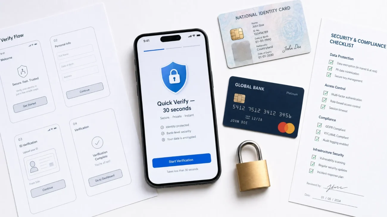
Every fintech product faces the same fundamental design tension at onboarding: the security measures strong enough to satisfy regulatory requirements and prevent fraud are, by their nature, the same measures that create friction for legitimate users. A verification flow that asks for a document scan, a selfie, and a liveness check is significantly more secure than one that simply accepts a name and email address. It is also significantly more demanding of the user’s time and patience, and a meaningful share of applicants will abandon the process before completing it.
The goal of well-designed Fintech identity verification is not to minimize security in order to improve conversion, nor to maximize friction in the name of thoroughness. It is to apply the right level of verification to each specific customer and transaction, in a way that is fast and transparent enough that legitimate users experience it as a brief, reasonable step rather than an obstacle. This balance is achievable, but it requires deliberate design across both the technology layer and the user experience layer.
What Does Balanced Fintech Identity Verification Mean?
Balanced fintech identity verification is a verification architecture in which the depth and method of identity confirmation applied to each user or transaction is proportionate to the risk level involved, while the user-facing steps are designed to be completed as quickly and intuitively as possible. In other words, the system does not apply maximum verification to every interaction. It applies the appropriate level of verification to each interaction based on the risk signal present at that moment.
This approach rests on two foundational principles that work together.
- Risk-proportionate verification: lower-risk interactions, such as account creation for a basic payment product in a mature regulatory jurisdiction, require standard document verification. Higher-risk interactions, such as accessing a crypto wallet or transferring a large sum to a new payee, require enhanced verification steps. The verification depth scales with the risk level.
- Experience-optimized execution: whatever level of verification is required, the user-facing steps should be designed to minimize unnecessary effort. This means fast document recognition, a minimal number of required actions, clear progress indicators, helpful error messages when a step fails, and no unnecessary data collection beyond what the verification purpose requires.
What is also important here is that these two principles are complementary, not competing. Applying lighter verification to genuinely lower-risk users does not reduce security. It appropriately calibrates the compliance investment to the actual risk exposure, while reserving heavier verification for the interactions where it genuinely matters.
Where the UX-Security Tension Is Sharpest in Fintech
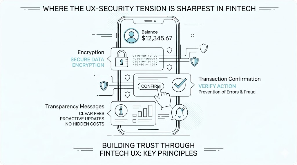
The friction vs. security trade-off is not equally significant across all verification touchpoints. The following contexts represent the highest-stakes environments for this balance.
Initial Account Onboarding
The onboarding step is where the tension is most visible and most consequential. Applicants at this stage have made a choice to try the product but have not yet experienced its value. Their tolerance for friction is at its lowest. At the same time, this is where the foundational compliance record must be established. A verification flow that takes more than 3 to 5 minutes, requires multiple retakes of document photos, or presents confusing instructions will lose a significant share of otherwise eligible applicants before they reach account activation.
Step-Up Verification at Transaction Thresholds
When a customer’s activity triggers enhanced due diligence requirements, for example a transaction above a defined value or access to a higher-risk product, the verification request arrives mid-session. The user is in the middle of completing an action they intended to complete, and an unexpected verification request feels like an interruption rather than a security measure. Here is when seamless UX design is especially critical: the step-up request must be clearly explained, fast to complete, and positioned as a brief formality rather than a barrier.
Re Verification and KYC Refresh
Periodic re-KYC requests arrive to customers who have already been through the verification process once and may not understand why they are being asked to repeat it. Unclear communication about why re-verification is needed and what will happen if it is not completed leads to high abandonment rates at this stage. Given this, the user communication surrounding a re-verification request is almost as important as the technical execution of the verification itself.
High Risk Customer Segments and Markets
Customers onboarding from higher-risk jurisdictions, or products targeting segments with elevated fraud risk may also require stronger monitoring systems such as affiliate fraud detection to identify suspicious acquisition activity and prevent abuse before accounts are approved.. In these cases, the goal is not to make enhanced verification feel the same as standard verification, but to make it feel worthwhile. Explaining why additional steps are required, what data is being collected, and how it is protected can meaningfully reduce abandonment even when the verification flow is objectively more demanding.
Design Principles for Balanced Identity Verification
Achieving the right balance between security and experience requires applying consistent design principles across the verification flow. The following principles are the most impactful.
Progressive Disclosure of Requirements
Showing the user the full verification requirement upfront, as a numbered list of steps with estimated time, consistently reduces abandonment compared to revealing requirements one step at a time with no visible end point. A user who knows they are starting a 3-step process that will take 2 minutes is significantly more likely to complete it than a user who does not know how many steps remain. Progressive disclosure converts an unknown burden into a known and manageable one.
Inline Guidance During Document Capture
- A large share of verification failures and retakes occur because users do not photograph their document correctly on the first attempt. Inline guidance, such as real-time frame alignment feedback, lighting quality indicators, and animated instructions showing how to hold the document, drastically reduces the number of retakes required. This positively affects both the completion rate and the user’s perception of the product’s technical quality.
Transparent Communication About Data Use
Users who understand why their document is being scanned, what data will be retained, and how it is protected are significantly more willing to complete the verification step than users who are presented with a document upload request without context. A brief, plain-language explanation of why verification is required, positioned immediately before the capture step, improves completion rates without adding meaningful time to the flow.
Fast, Clear Result Communication
Verification results should be communicated in plain language within seconds of submission. A user who submits a document and then waits without feedback for 30 or more seconds is more likely to abandon the session than one who receives immediate confirmation that the submission is being processed. Real-time or near-real-time verification pipelines make this possible and should be a baseline requirement for any fintech verification implementation.
What Reliable Fintech Identity Verification Should Have
Fintech product and compliance teams evaluating verification platforms should assess both the security capabilities and the UX support features of each solution. The following criteria define a solution that can deliver the balance described above.
- Sub-60-second end-to-end verification. The complete pipeline, from document capture to result, should complete in under 60 seconds for a standard verification under normal conditions. We recommend testing this on mid-range mobile devices representative of the target user base, not only on high-end reference hardware.
- Real-time image quality feedback during capture. The SDK or web component should provide live feedback on document framing, lighting, and blur before accepting an image for processing. This single feature has the largest impact on first-attempt success rates.
- Passive liveness detection as the default mode. Active liveness detection, which requires the user to perform specific movements, adds meaningful friction. Passive liveness, which analyzes a single image or short video for biological indicators without user action, should be the default wherever it meets the regulatory requirement. Active liveness should be configurable for higher-risk tiers where the additional assurance is needed.
- Configurable verification tiers with per-segment rules. The platform should support different verification flows for different customer segments, product tiers, and risk levels. You should attentively analyze whether tier configuration is available through an admin interface or requires code changes.
- Localized UI and multi-language support. Verification interfaces presented in the user’s language with region-appropriate examples of acceptable document types deliver significantly higher completion rates than generic English-language interfaces. The most highly demanded options are platforms that support localization for all target markets without requiring custom development.
- Detailed failure messaging with recovery paths. When a step fails, the user should receive a specific explanation of what went wrong and a clear instruction for how to correct it. Generic error messages that say only that verification failed cause abandonment. Specific, actionable messages enable recovery.
How to Design a Fintech Verification Flow That Works for Both Security and UX
Designing an effective verification flow requires input from product design, compliance, and engineering working in coordination. The following steps outline the key design decisions.
- Map verification requirements to user journey stages before designing the flow. Understand which regulatory requirements apply at each stage of the customer journey, so that the verification steps in the flow are purposeful rather than additive. Every step that cannot be justified by a specific compliance or risk requirement is a friction point that should be removed.
- Set measurable completion rate targets before launch. Define what a successful verification flow looks like in quantitative terms, for example, a target completion rate for standard onboarding. It will be helpful to baseline current rates before making changes so that the impact of design decisions can be measured accurately.
- A/B test the user-facing components of the verification flow. The placement of the document capture prompt, the wording of the data use explanation, the design of the progress indicator, and the content of error messages are all variables that affect completion rates and can be tested independently. Treat the verification flow as a product to be optimized, not a compliance requirement to be tolerated.
- Monitor fallback and retry rates as leading indicators of friction. High document retake rates, high fallback-to-manual-review rates, and high abandonment rates at specific steps all indicate friction that has not been identified in the initial design. Track these metrics from day one and investigate anomalies promptly.
- Review verification UX whenever compliance requirements change. Regulatory updates that add new verification steps or modify acceptable methods create opportunities to redesign the surrounding UX rather than simply inserting the new step into the existing flow. We recommend treating each compliance update as a prompt to review the entire verification experience rather than a patch to be applied in isolation.
Conclusion
Fintech identity verification does not require a choice between security and user experience. The two are reconcilable through risk-proportionate verification design, fast and accurate technology execution, and deliberate UX decisions that make each step clear, brief, and purposeful. The tension between compliance thoroughness and conversion performance is real, but it is a design problem, not an inherent constraint of the technology.
Products that solve this design problem correctly gain on both dimensions simultaneously: they satisfy regulatory requirements with a verification record that is complete and auditable, and they deliver an onboarding experience that converts a higher share of legitimate applicants. These mechanics boost the long-term value of the verification investment beyond compliance alone, turning it into a product quality differentiator in a competitive market.