
Blog
Six Reasons Your Customers Are Not Using Online Payments And How To Fix Each One

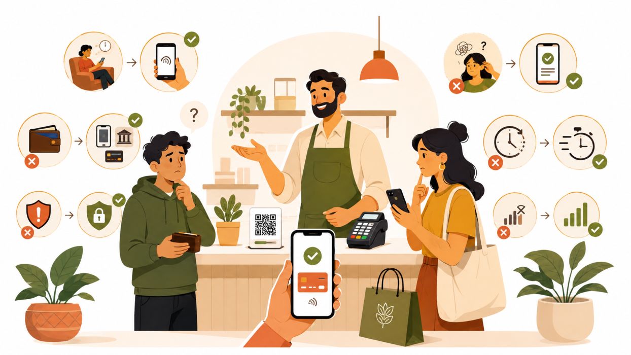
There is a specific kind of frustration in watching a customer choose the slower option. The payment page works. You tested it twice. And they still count out bills at the counter, or ask if they can settle it on delivery, or say they will transfer the amount later and then quietly don’t.
The instinct is to read this as resistance to technology. It almost never is. The country-level shift already happened: digital payments accounted for 64.7 percent of retail transaction volume in 2025, up from 57.4 percent the year before, with QR Ph transactions overtaking debit and credit cards for the first time. The person hesitating in front of you almost certainly pays digitally somewhere else, probably that same week.
So the useful question is not whether your customers will pay online. It is why they will not pay online with you. Below are the six answers that come up most often, what each one actually looks like from the customer’s side, and what to change—fair warning: two of them are probably not what you think.
1. Habit Is Not The Same As Resistance
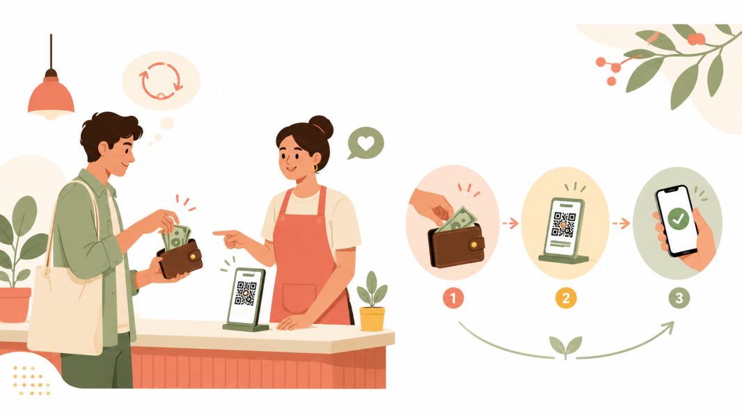
People do not abandon a payment method because they distrust the alternative. They keep the old one because nothing has ever forced a decision. Cash requires no account, no password, no confirmation screen, and no moment of doubt. It is the default in the truest sense: what happens when nobody chooses anything.
Account ownership is no longer the bottleneck it once was. The World Bank’s Global Findex Database 2025 puts global account ownership at 79 percent of adults, up from 74 percent in 2021, with mobile phones doing most of the heavy lifting. Most of your hesitant customers already hold the account. What they lack is a reason to use it here, today, with you.
The practical move is to stop asking them to travel to your payment method and instead put payment where the conversation already is. If most of your orders arrive through chat, an online payment link sent directly into that thread removes every navigational step between “I’ll take two” and money changing hands. There is no site to find, no cart to build, no account to create. For a business without a full storefront, this is often the entire fix.
Incentives help, but only if they are small and time-boxed. A permanent five percent discount for paying online is not an incentive; it is a price cut. A one-time bonus on a first digital payment gives someone a reason to break the habit once, which is all you need.
2. Your Checkout Asks For More Than It Needs
This is the least glamorous problem on the list and the most common. Baymard Institute’s ongoing cart abandonment research puts the average documented abandonment rate at 70.22 percent across 50 studies. Setting aside the 42 percent of shoppers who were only browsing, 17 percent walked away specifically because the checkout was too long or too complicated, and another 18 percent left because the site insisted they create an account first.
The size of the gap is what makes this worth acting on. Baymard’s usability testing suggests a well-built checkout can run to roughly 12 to 14 form elements, while the average checkout flow they benchmark shows 23.48 by default. That is close to double the necessary length, and every extra field is a small invitation to give up.
Go through your own checkout with a pen and cross out anything you do not use. Company name on a consumer order. Address line two. A separate billing address that is identical to the shipping address nine times out of ten. Phone number collected twice. Then add guest checkout, because forcing account creation before a first purchase trades a sale you could have had for data you probably will not use.
Note that this research reflects US shoppers, so treat the percentages as direction rather than gospel. The mechanism is universal even where the exact figures are not.
3. You Are Offering The Wrong Options, Not Too Few
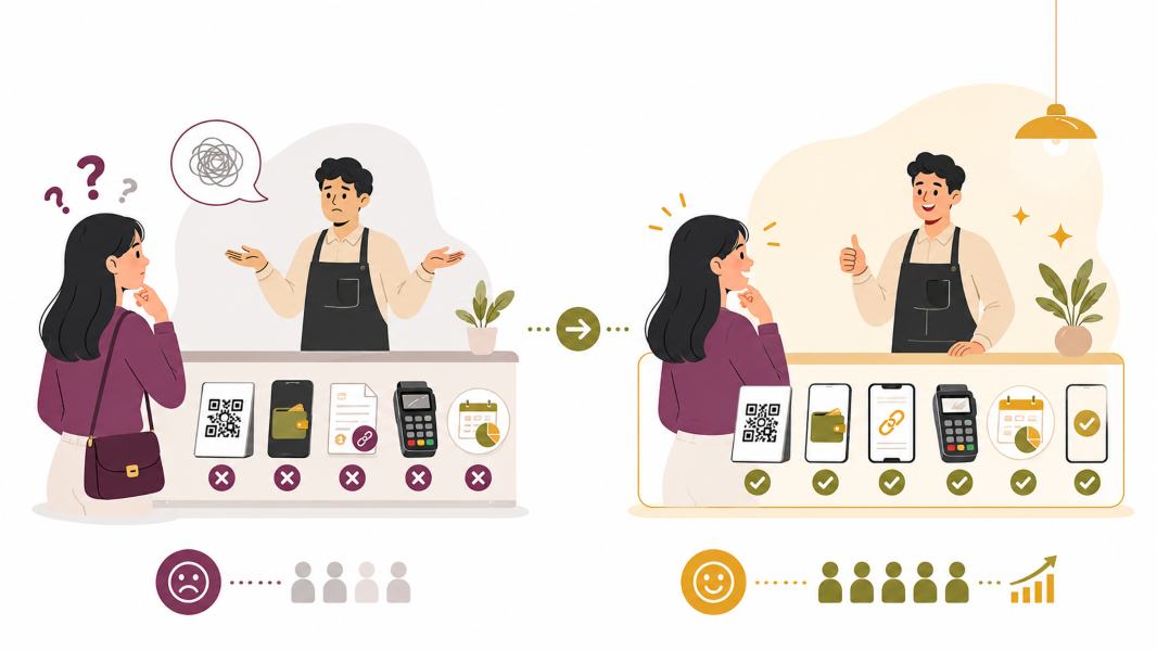
Here is the counterintuitive one. In the same Baymard breakdown, only 9 percent of shoppers abandoned because there were not enough payment methods. It ranks near the bottom of the list. Most merchants assume this is their main problem, and for most merchants it is not.
The real failure is subtler: offering options that are technically available but wrong for the people actually buying from you. A checkout built around credit cards in a market where interoperable, account-based payments now outrun cards is not short on options. It is pointed in the wrong direction.
So resist the urge to bolt on a dozen providers. Every additional method is another reconciliation line, another dispute process, another thing to test after an update. Instead, look at how your last fifty customers paid or asked to pay, and make those the frictionless paths. Add a national QR standard, one major wallet, and bank transfer before you add a fourth card processor.
4. The Price Changes Between The Product Page And The Payment Page
Of everything customers can be annoyed by, this is the one that reliably kills sales. Excluding the browsers, 40 percent of abandoned carts in Baymard’s data trace back to extra costs being too high, and a further 12 percent to shoppers being unable to see or calculate the total up front. Nothing else on the list comes close.
Read those two numbers together, and the problem clarifies. It is not really about the amount. A customer who sees a delivery fee on the product page and buys anyway has accepted the same peso figure that would have made them quit at step four. What they will not accept is the feeling of being handled: agreeing to one number and being shown another once they are committed.
Fix it by moving every cost earlier than feels comfortable. Put delivery estimates on the product page rather than the cart. State convenience fees in the same breath as the price, not in small type near the confirm button. If a fee genuinely cannot be calculated until an address is entered, say so explicitly and give a range. Customers forgive a fee they were warned about. They do not forgive a surprise.
5. Trust Is Built Long Before Anyone Reaches Checkout
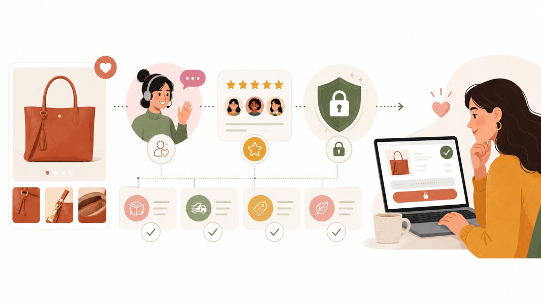
Security concerns are real: 19 percent of non-browsing abandonments in the Baymard data came down to shoppers not trusting the site with their card details. But the common response, adding a row of security badges above the pay button, mistakes where the doubt forms.
Nielsen Norman Group’s long-running work on trustworthiness in web design identifies four factors that shape whether people believe a site: design quality, up-front disclosure, comprehensive and current content, and connection to the rest of the web. Notice that none of them live on the payment page. By the time someone reaches checkout, the verdict is mostly in. A badge cannot repair an impression formed three pages earlier by a broken layout, a contact page with no address, or a blog last updated in 2022.
The substantive work sits behind the interface. Use a payment provider that handles card data so it never touches your server, and read the PCI Security Standards Council’s guidance for merchants to understand which obligations remain yours regardless of who processes the transaction. Then say what you do in plain language: who processes the payment, what you store, what you don’t.
It also helps to know the environment your customers are reading you in. Awareness of account scams has risen sharply since the Anti-Financial Account Scamming Act was signed in July 2024, and buyers have absorbed the warnings. Someone hesitating over your payment page may be applying a rule they learned elsewhere, correctly, about not clicking unfamiliar links. Anticipating that suspicion out loud does more good than any badge.
6. On A Weak Connection, Every Extra Second Is A Decision Point
Connectivity is uneven, and a payment flow that feels instant on office wifi can feel broken on a shared mobile signal in the afternoon. Google’s Core Web Vitals guidance treats a Largest Contentful Paint of 2.5 seconds or less as the threshold for a good experience, measured at the 75th percentile of real visits. That last part matters: your fastest loads tell you nothing. Your slower quarter is where the abandonment happens.
Baymard’s data also shows 17 percent of non-browsing abandonments came from sites that produced errors or crashed outright, putting technical failure level with a complicated checkout as a cause of lost sales.
Three things help disproportionately. Keep the payment page light, because a checkout carrying analytics scripts, chat widgets, and a video header is a checkout that fails first on a poor connection. Confirm receipt immediately and visibly, since the worst moment in any payment is the silence after submitting. And make failure recoverable: if a transaction times out, the customer should land somewhere that tells them what happened and whether they were charged, rather than a blank screen that leaves them wondering whether to try again. The BSP’s 2024 report on the status of digital payments covers the consumer redress rules now placing turnaround expectations on payment service providers for exactly this situation. Knowing the process lets you explain it, which is often all a worried customer needs.
Run This Thirty-Minute Audit Before You Change Anything
Most merchants read a list like this and fix the item that sounds most familiar. That is usually the wrong one, because the failures you notice are the ones customers complain about, and customers rarely complain about the thing that made them leave silently. Do this instead, on a phone, on mobile data, with your work wifi turned off.
- Buy from yourself. Start from a link a customer would actually receive, not your admin dashboard. Complete a real purchase for the smallest amount you sell and refund it afterward.
- Count the taps. From the moment you decide to buy until money leaves the account. Write the number down. Anything above eight deserves scrutiny.
- Count the fields. Every input, dropdown, and checkbox on the checkout, including ones that are pre-filled. Compare against the 12 to 14 element benchmark.
- Track the price. Note the number shown when you decide to buy, and the number on the confirmation screen. If they differ, find the exact step where it changed. That step is a leak.
- Break it on purpose. Switch to airplane mode midway through payment, then reconnect. Whatever you see next is what a customer on a weak signal sees. If it does not tell them whether they were charged, that is your first fix.
- Ask three customers who paid cash. Not “why don’t you pay online,” which invites a polite non-answer, but “what happened the last time you tried?” The answers will not match your assumptions.
Translating What Customers Actually Say
Customers rarely name the real obstacle, partly out of politeness and partly because friction is felt rather than analyzed. A rough translation guide:
| What they say | What it usually means | Where to look |
| “Cash na lang, mas madali” | The flow has too many steps or too many fields | Reason 2 |
| “Wala akong card” | Your available methods do not match your market | Reason 3 |
| “Ang mahal pala ng total” | Costs appeared after commitment, not before | Reason 4 |
| “Baka scam” or a long pause before clicking | Credibility was lost earlier in the journey | Reason 5 |
| “Hindi gumagana” or “na-cut” | Timeouts, heavy pages, or unrecoverable failures | Reason 6 |
| “Next time na lang” | Nothing has ever forced a decision | Reason 1 |
Two Numbers Worth Watching Afterward
Once you have changed something, resist judging it by total online payment volume, which moves for reasons that have nothing to do with your checkout. Two narrower numbers tell you far more.
The first is the completion rate between reaching your payment page and a confirmed transaction. This isolates the checkout itself from everything upstream, so a change here is genuinely attributable to what you altered. The second is the share of repeat customers who pay the second time digitally. First payments are influenced by curiosity and incentives. Second payments are influenced only by whether the first one felt fine. If people who paid you online once revert to cash, the problem is not persuasion. Something in that experience quietly disappointed them, and no amount of encouragement at the front end will fix it.
There is one more thing worth doing, and it costs nothing. Note the date you ran the audit and put a reminder six months out to run it again. Payment integrations drift. Plugins update, providers change their flows, a theme revision adds two hundred kilobytes to the checkout page, and none of it announces itself. Most of the friction described above did not exist on the day the store launched. It accumulated, one small change at a time, while everyone was busy.
Disclaimer: This article is provided for general informational purposes only and does not constitute financial, legal, or regulatory advice. Payment regulations, provider features, and compliance obligations change over time and vary by jurisdiction. Business owners should consult their payment service provider and, where relevant, a qualified professional before making decisions about payment acceptance, fee disclosure, or data security practices.