
Blog
Creating Multiple Versions Of A Single Image With AI Tools


One good image used to be one usable asset. Now it is a starting point. A single shot can cover a dozen placements once you begin adjusting the lighting, shifting the colour story and reworking the crops, and no second booking is needed to get there. That is what an AI image generator is built for, and with its newest model, Seedream 5.0 Pro, Dreamina has made the process quick enough to use as a normal part of the week rather than as an occasional trick.
Why Was One Image Never Enough?
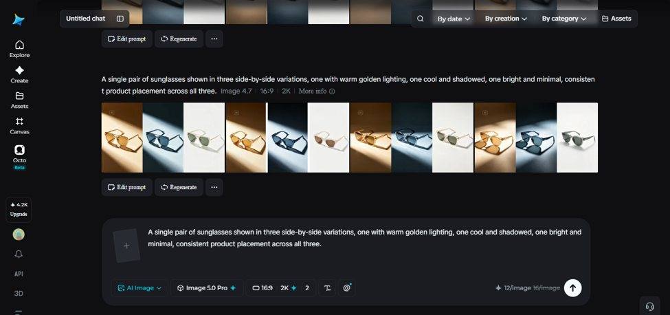
A photo framed for a homepage banner rarely suits a square social post, so half the point of the picture gets cropped away. A bright, high energy campaign shot does not fit a quieter seasonal message either. The old fix was to shoot variations from scratch, which costs time and money that marketing teams and small businesses do not always have. Generating variations works differently. The core idea stays intact and everything around it, the tone, the format and the mood, adapts to wherever the image is going next.
It also helps to know which pictures are worth the effort. Eye tracking published by the Nielsen Norman Group found that people study product shots and photos of real people while skipping purely decorative filler images. A study of social posts published in EDIS pointed the same way, reporting that photos taken in house outperformed stock photography on engagement, although a stock image still beat posting nothing at all.
- One frame cannot hold every aspect ratio without losing something
- Seasonal moods change faster than photo budgets do
- Text overlays need calm space that a tight product shot may not have
- A strong original raises the ceiling for every version built from it
How Many “Versions” Are There?
Before creating anything, it is worth naming what you are actually changing. A few basic directions cover most sets:
- Mood and lighting, moving between soft, bright and darker treatments
- Warm against cool colour, and saturated against muted
- Aspect ratio and crop for different platforms and placements
- Background or setting, when the product stays and its surroundings change
- On-image text, including translated versions of the same layout
Colour deserves a little care here. The review of colour psychology by Elliot and Maier in the Annual Review of Psychology found that colour genuinely affects how people respond, but that the meaning depends on context rather than being fixed. Treat a warm version as something to test, not as a decision already made. Naming your directions this way also stops you from ending up with ten images that differ in unhelpful ways.
Interact With Dreamina’s Seedream 5.0 Pro
What makes Seedream 5.0 Pro suited to variation work is that it can separate an image into parts you adjust individually. Point selection, lasso tools and sketch guidance let you change one aspect of the composition, a background, a shadow or a colour, without disturbing anything else. Layer separation extends that, since the subject, background and text can move independently between versions instead of the whole frame being regenerated every time something small changes.
- 2K resolution output that holds up across formats rather than looking dated in a larger placement
- Native text in 14 languages for region specific versions
- Built-in research that keeps output details current
- Selective editing that keeps version three recognisably related to version one
Single Image To Complete Series Of Variations
This is the part that used to take hours of manual editing. Here is how it runs in Dreamina.
Step 1: Type A Prompt And Include A Reference Picture
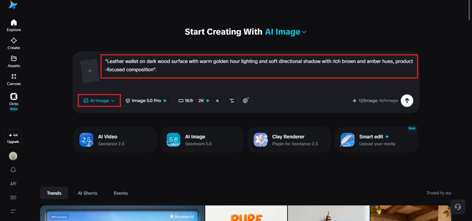
Open Dreamina and write a specific description of your base image covering the subject, the setting, the lighting and the mood. Upload the original photo as a reference so each new version stays tethered to it.
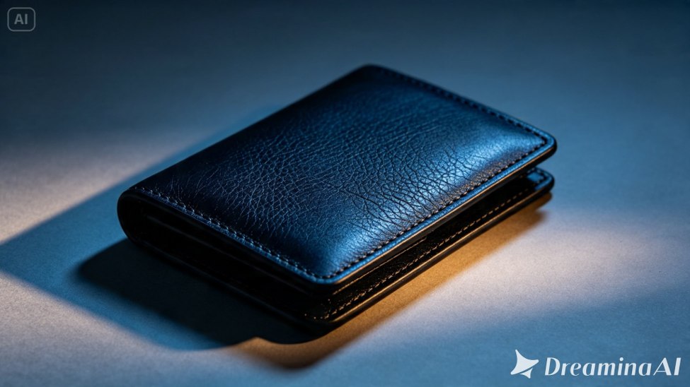
A workable starting prompt reads like this: leather wallet on a dark wood surface, warm golden hour lighting, soft directional shadow, rich brown and amber tones, product focused composition.
Step 2: Adjust Parameters And Generate
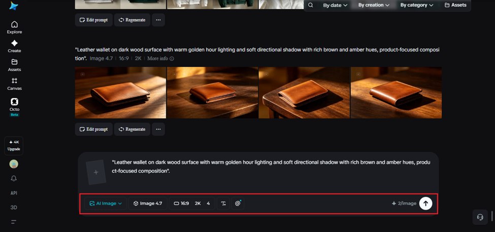
Select Image 5.0 Pro by Seedream 5.0 Pro as your model. Set the resolution, with 1K being fast enough for drafts and 2K for anything final, then set the aspect ratio and size for the placement this particular version is meant for. Once that is dialled in, generate.
Generating the hardest crop first is a habit worth keeping. If the composition survives a vertical frame, the wider ones almost always work.
Step 3: Customise And Download
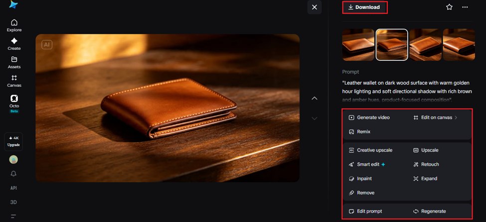
A version rarely lands perfectly on the first attempt. Correct a colour that sits slightly off or fix a detail that misses the mood using inpaint, expand, remove and retouch, which is faster and more predictable than rewriting the prompt. When it looks right, download it and move to the next variation.
Two small things at this stage save time later. Descriptive filenames and accurate alt text are part of Google’s own image SEO best practices, and they are far easier to write while you still remember why each version exists. Keeping the embedded credentials described by the Content Authenticity Initiative intact is also useful, since that record of how a file was made and edited travels with it.
Making Variations That Still Feel Like A Family
This is controlled range rather than chaos. A few habits keep versions looking connected instead of unrelated:
- Keep the subject in the same position and at the same scale across versions
- Change only one or two elements per version rather than moving everything at once
- Feed the same reference image into every generation instead of building each version off the last
- Keep one plain version as a control to compare the others against
Following those rules means the differences between your files are deliberate rather than accidental.
Typical Pitfalls In Creating Variations
A few habits quietly undo what should be a clean set of options:
- Mixing elements at random so the versions no longer make sense together
- Losing the original image and letting each alternative drift on its own
- Forgetting which version was made for which platform
- Placing headline text over a recoloured background without rechecking legibility
- Changing how the product itself looks rather than how it is styled
The last two are worth a second look. W3C guidance sets a minimum contrast ratio of 4.5:1 for normal text, and a warmer background can quietly push an overlay under it. Altering the actual appearance of what you are selling is a different matter again, since that moves from styling into a claim, which is the ground covered by the FTC’s advertising guidance for small businesses.
None of this means every variation has to be flawless to earn a place in your set. Some of the most useful versions start as rough, slightly wrong drafts and get fixed in the customisation step rather than in the prompt. Treat the first generation as a sketch instead of a final answer, and the whole process stops feeling like a hunt for perfection on the first try.
Where Do Multiple Versions Actually Pay Off?
The workflow earns its keep in a few clear situations:
- A/B testing different moods or colour combinations in ads, which needs at least two candidates before it tells you anything, as Harvard Business Review’s refresher on A/B testing sets out
- Adapting one hero shoot across several platforms and formats
- Quick refreshes of seasonal content that needs a new look but not a new shoot
- Regional versions where the layout stays and only the language inside the image changes
When flexibility matters more than a single perfect image, this saves real time. When it does not, the extra versions are simply extra files to review.
Wrapping Up
One image used to be the finish line. It is closer to a first draft now. Dreamina and Seedream 5.0 Pro let you take a single reference image and build several usable variations from it, each suited to a different mood, platform or campaign. Same idea, different clothes, cut for wherever it is going.
Disclaimer
This article is for general information only. Tool features and model specifications change often, so confirm current capabilities with the provider before relying on them. Nothing here is legal or regulatory advice, and advertising, accessibility and disclosure rules vary by country.
References
- Elliot, A. J., and Maier, M. A. (2014). Color psychology: Effects of perceiving color on psychological functioning in humans. Annual Review of Psychology, 65, 95-120. https://doi.org/10.1146/annurev-psych-010213-115035
- Zagonel, A., Baker, L. M., Shellhouse, J., Boyer, C., Peterson, H., and Morrison, A. (2023). Choosing the right visual for social media: Comparing the engagement of stock photos versus natural photos. EDIS, 2023(6). https://doi.org/10.32473/edis-wc444-2023
- Nielsen, J. (2010). Photos as Web Content. Nielsen Norman Group. https://www.nngroup.com/articles/photos-as-web-content/
- Gallo, A. (2017). A Refresher on A/B Testing. Harvard Business Review. https://hbr.org/2017/06/a-refresher-on-ab-testing
- W3C Web Accessibility Initiative. Understanding Success Criterion 1.4.3: Contrast (Minimum). World Wide Web Consortium. https://www.w3.org/WAI/WCAG21/Understanding/contrast-minimum.html
- Google Search Central. Image SEO Best Practices. Google for Developers. https://developers.google.com/search/docs/appearance/google-images
- Federal Trade Commission. Advertising FAQ’s: A Guide for Small Business. FTC Business Guidance. https://www.ftc.gov/business-guidance/resources/advertising-faqs-guide-small-business
- Content Authenticity Initiative. How It Works. https://contentauthenticity.org/how-it-works