
Blog
What Companies in Utah Should Include on a Professional Homepage

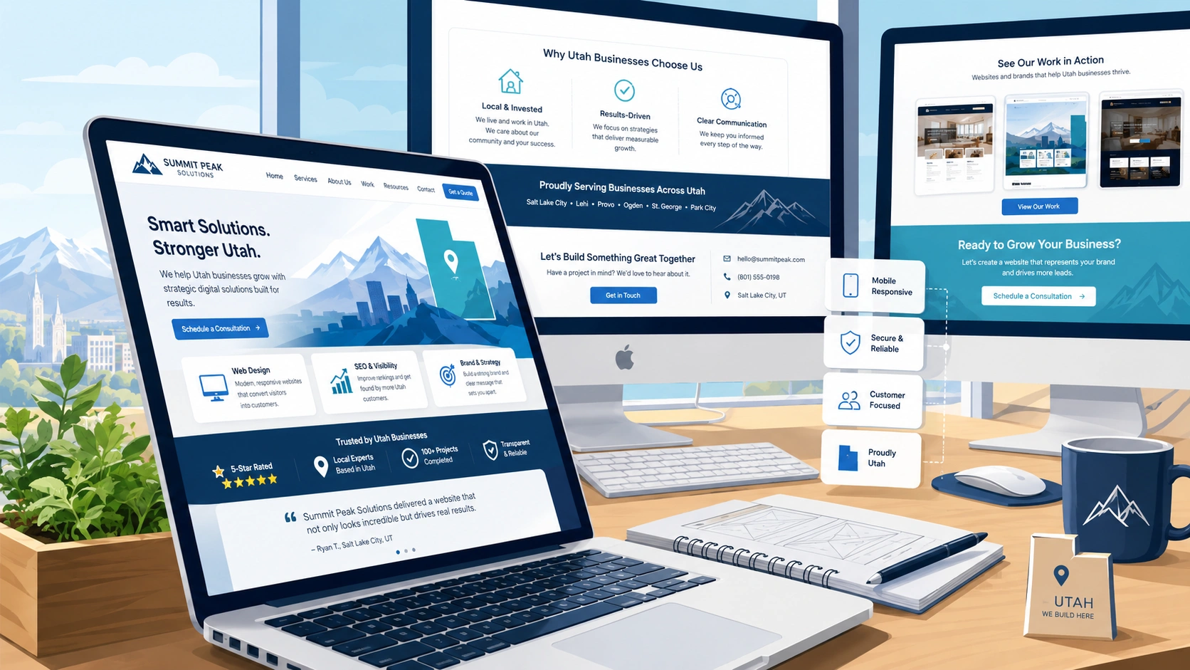
Most people land on a company homepage in a hurry and half-expecting to be disappointed. They clicked a search result, tapped an ad, followed a referral, or found a local listing, and now they are giving the page a few seconds to prove it was worth the click. If the page makes them work to figure out what the business does or whether it serves them, they leave and try the next result. Research summarized by the Nielsen Norman Group found that visitors often abandon a page within 10 to 20 seconds, which means a homepage has to make its value clear in about ten. That is not much time to earn a second look.
Strong Utah web design treats the homepage as a decision-making tool rather than a brochure. A visitor arrives with a rough question in mind, something like “can these people fix my problem, and are they the kind of business I want to deal with?” The job of the page is to answer that quickly, build enough trust to keep them reading, and point them toward one obvious next step. Everything below serves that goal. None of it is decoration.
Say What You Do, Who It Is For, and Why It Matters
The single most common homepage mistake is making a visitor guess. A clever tagline, a stock photo of a handshake, and a vague promise about “solutions” tell a person nothing. They still do not know what the company sells, who it serves, or why they should care.
The top of the page should name the business category, the primary market, and the practical value in plain language. A roofing company in Ogden should read like a roofing company in Ogden, not a lifestyle brand. If a local visitor cannot tell within a glance that they are in the right place, the writing is doing marketing at them instead of helping them.
Keep the supporting line short. One clear sentence under the headline can carry the weight, something that answers “what do I get and how is my life better.” Save the full story for the About and service pages. The homepage is not the place to explain everything. It is the place to make a visitor want to keep going.
A few honest questions to test your opening against:
- Could a stranger describe what you sell after reading only the top of the page?
- Is it obvious this business serves their area, not a company three states away?
- Does the headline promise a real outcome, or use words that sound impressive?
If the answers are shaky, that is usually where you are losing people, and it is the cheapest part of the page to fix.
Give the Page One Job

Every homepage needs one clear action that matches how the business actually turns interest into work. That might be requesting a consultation, starting a project conversation, booking an appointment, or filling out a short inquiry. Pick the one that fits your sales process and make it the obvious thing to do.
The wording matters more than people expect. A button that says “Click Here” describes nothing. A button that says “Request a Free Estimate” or “Book a Consultation” tells the visitor exactly what happens next, which lowers the small hesitation that kills clicks. Describe the action, not the mechanic.
Resist the urge to offer five equal choices at the top of the page. When everything is emphasized, nothing is, and a visitor who has to weigh several competing buttons often picks none of them. Lead with one primary action, give it room to breathe, and let the secondary options sit lower or smaller. You can absolutely include a phone number and a “see our work” link, but they should support the main path, not compete with it.
Make Navigation Obvious, Not Clever
A menu is a promise about where things are. When the labels are plain, and the structure is logical, visitors move through the site without thinking about it, and search engines can read the relationships between your pages more easily. When the labels are cute, or the structure is scattered, people get lost and leave.
Use familiar, descriptive labels. About, Services, Projects or Portfolio, and Contact are boring on purpose, and boring is exactly what a lost visitor wants. This is where planning pays off. A designer who maps the user flow first, meaning the path a real person takes from landing to inquiry, will build a menu around the decisions a visitor actually makes rather than around the company’s internal org chart. The two are rarely the same.
Useful destinations usually include:
- An About page that covers experience, values, and the people behind the work
- Service pages that each describe one area of what you do in real detail
- Project examples or a portfolio that shows the kind of work you take on
- A contact or inquiry page for qualified questions
Keep the header uncluttered, especially on phones where space is tight, and a bloated menu turns into a wall of taps. Navigation research from the Baymard Institute consistently shows that overloaded menus and unclear labels are a major source of user frustration, so fewer, clearer choices almost always beat a comprehensive but crowded menu.
Earn Trust With Evidence, Not Adjectives
Visitors do not take a company’s word for it, and they should not have to. Calling yourself “trusted” and “leading” proves nothing. Showing why you are trusted is what moves someone from curious to willing to call.
Trust comes from specifics. Real testimonials with a name attached, relevant credentials or licenses, measurable outcomes, and concrete project examples all give a visitor a reason to believe you. A single detailed result from a nearby client does more than a wall of five-star icons with no substance behind them. Each trust element should connect directly to the work you do rather than sit there as generic praise.
One point worth taking seriously: testimonials and results have to be truthful and something you can back up. The Federal Trade Commission’s guidance on endorsements and testimonials makes clear that reviews should reflect honest, real experiences and that fabricated or misleading endorsements can create legal exposure. Beyond the legal side, invented praise reads as hollow to visitors anyway. Accurate, specific, verifiable evidence is both the safer path and the more persuasive one.
Keep the Brand Consistent and Readable

Colors, type, imagery, and the voice of the writing should feel like they came from the same place. Consistency makes a page feel deliberate and put together. It helps people recognize the business the next time they run into it, whether that is on social media, in an email, or in a local ad. A homepage that looks like three different sites stitched together quietly signals that the business might be just as disorganized.
Consistency is not only an aesthetic concern. It has to serve readability. Text needs enough contrast against its background, comfortable spacing, and clear separation between sections so the eye can move through the page without strain. Low-contrast gray text on a slightly lighter gray might look sleek in a design mockup and be nearly unreadable in real sunlight on a phone. The World Wide Web Consortium’s Web Content Accessibility Guidelines set practical standards for things like color contrast and readable text, and following them helps every visitor, including the large share of people browsing on small screens in bad lighting or with less than perfect vision. Designing for readability is not a favor to a niche audience. It is designing for how people actually use the web.
Build It So Search Engines and People Both Get It
A homepage can look beautiful and still be invisible, because the same structure that helps a search engine understand a page also helps a human skim it. Descriptive headings, honest page copy, sensible internal links, and accurate page titles and descriptions all help Google make sense of what a page is about and who it should reach.
Google’s own SEO Starter Guide lays out the fundamentals in plain terms: write clear title tags and meta descriptions, use a logical heading structure, link your pages together in a way that reflects how they relate, and above all create content that serves the visitor rather than tries to trick a crawler. There are no shortcuts that reliably game the system, and the tactics that promise instant rankings tend to age badly. The durable approach is to make a genuinely useful page and make it easy to understand.
Practically, that means the headline and subheadings should describe the content, not just look stylish. It means service pages should say what the service is in words a customer would search for. And it means the internal links from the homepage should point to the pages that matter, so both people and search engines can find the depth behind the front door.
Speed and Mobile Are Part of the Design
A gorgeous page that loads slowly is slow, and visitors treat slow pages the way they treat a long line: they leave. Performance is not a technical detail bolted on at the end. It is part of whether the design works at all.
Google publishes a set of Core Web Vitals, which are measurable signals for how a page loads, how quickly it becomes interactive, and how stable it is while it renders. These affect both the experience and, increasingly, how the page performs in search. You do not need to memorize the metrics to benefit from them. You do need to make sure the site is not shipping oversized images, blocking scripts, and layouts that jump around while a person is trying to tap a button.
A simple habit helps here: test the real thing. Running your live homepage through PageSpeed Insights gives you a concrete read on speed and specific suggestions, on both mobile and desktop. Check it on an actual phone too, ideally on a normal cellular connection rather than office wifi, because that is closer to how a lot of Utah customers will first see the page. If the homepage feels sluggish or cramped on a mid-range phone, that is the version most people are judging you by.
Make the Contact Path Effortless
For most local businesses, the whole point of the homepage is to turn a visitor into an inquiry, which usually runs through a form. A form that is confusing, too long, or broken quietly throws away leads the rest of the site worked to earn.
Keep it short and ask only for what you actually need to respond. Every extra field is another reason to abandon the form, so if you do not need a company name or a phone number to reply, do not require it. Label each field clearly, show a plain confirmation when the form is sent, and make sure the whole thing works with a thumb on a phone, not just a mouse on a desktop. Guidance from MDN Web Docs covers how to build forms that are accessible and reliable, including proper labels and inputs that behave well on mobile keyboards, which is the difference between a form people can fill out one-handed at a stoplight and one they give up on.
Test the form yourself, from a phone, and actually confirm the message arrives where it should. A contact form that silently fails is worse than no form at all, because the business never even knows about the customers it lost.
Choose a Utah Designer Who Plans Before Building

Good homepages are planned, not decorated after the fact. A designer worth hiring starts with the business goals and the path a visitor takes, then builds the page structure and content around that, so navigation is intuitive, the important information is easy to find, and the whole thing can grow as the business changes. That kind of structured thinking is also what makes future updates painless instead of a rebuild every time you add a service.
When you are evaluating designers, look past the portfolio’s prettiest screenshots and ask how they think.
- Do they start with what the business is trying to achieve and who the customer is?
- Do they plan the flow before choosing colors?
- Can they explain why a page is organized the way it is, in terms of the visitor’s decision rather than their own taste?
A designer who leads with strategy will produce a homepage that keeps working long after the launch. In contrast, one who leads with visuals often delivers something that photographs well and converts poorly.
A Homepage Built Around Customer Decisions
A professional homepage answers four questions in the order a visitor asks them: what does this company do, is it for me, can I trust it, and what should I do next. Each section of the page earns its place by moving a person one step closer to that final action. Clear writing at the top, one obvious next step, honest evidence of quality, a consistent and readable look, content that both people and search engines can follow, fast and mobile-friendly performance, and a contact path that actually works together turn a homepage from a digital business card into something that brings in qualified inquiries.
None of this requires flash. It requires clarity, honesty, and the discipline to keep the visitor’s decision at the center. Get those right, and the homepage stops being a page people bounce off of and starts being the front door it was supposed to be.
Closing Thoughts
A homepage is never really finished. The business grows, adds a service, drops another, and learns what customers actually ask about, and the page should keep pace instead of hardening into whatever it happened to be on launch day. Treat it as something you revisit a few times a year, not something you frame and forget.
The most useful test costs nothing. Hand your phone to someone who knows nothing about the business and watch them try to figure out what you do and how to reach you. Say nothing while they poke around. Wherever they pause or squint is your next thing to fix, and it will teach you more than any opinion offered around a conference table.
The businesses that do well online over the long run are rarely the ones with the flashiest sites. They are the ones that stayed clear when it was tempting to be clever, and stayed honest when it was tempting to oversell. A good homepage is really just a steady promise that you will make things easy for the people you want to serve. Keep that promise on the page, and the page keeps working for you long after you stop thinking about it.