
Blog
How To Create Clear, Accessible Presentation Slides

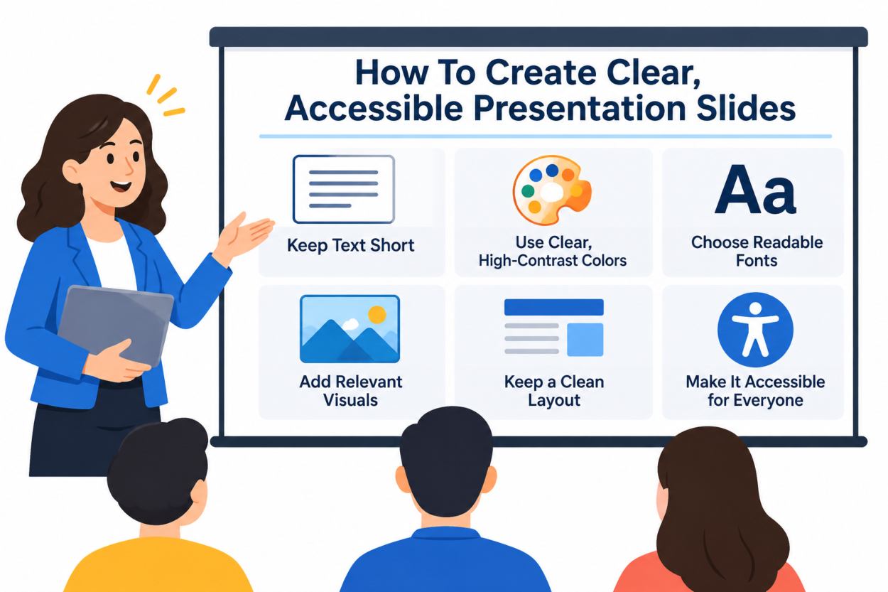
Strong presentation slides make it easier for people to understand a message, evaluate evidence, and decide what to do next. Whether you are creating a sales pitch, training session, project update, or classroom lesson, a PowerPoint integration workflow such as one found at https://www.beautiful.ai/integrations/powerpoint can be useful when your team needs to move between presentation tools without losing the structure of the deck.
The best decks are not defined by decoration. They are defined by a clear purpose, focused content, readable visuals, and a thoughtful review process. Start with the audience and the outcome you want, then make every slide earn its place.
Set The Purpose Before Designing
Many crowded decks begin with an unclear assignment. “Share the quarterly results” describes a topic, but it does not explain what the audience should understand or do. A more useful goal might be, “Help the leadership team approve next quarter’s hiring plan.”
Before opening a slide editor, write one sentence that names the audience, the decision or action, and the central point. That sentence becomes a filter. If a chart, detail, or image does not help the audience reach that outcome, move it to an appendix or remove it.
Shape The Deck Around The Audience
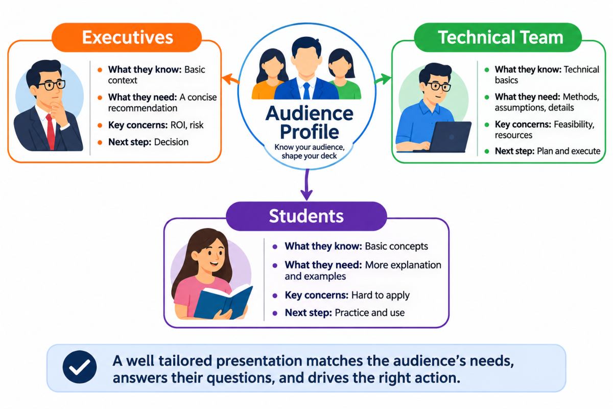
Ask what the audience already knows, what problem they need to solve, how much time they have, and what should happen after the presentation. Executives may need a concise recommendation and the reasoning behind it. A technical team may need assumptions, methods, and implementation details. Students may need more explanation and examples before they can apply a concept.
Create a brief audience profile before drafting. Include their level of familiarity, likely questions, concerns, and desired next step. The same subject can require a very different deck when the audience changes.
Build A Simple Slide Structure
A reliable presentation follows a clear path: establish the situation, define the problem or opportunity, show relevant evidence, present options, and recommend a next step. Each slide should answer one question that moves the audience forward.
Use headlines that communicate the point rather than label the category. “Customer Feedback” is a label. “Customers value speed but struggle with setup” tells the audience what matters. Before designing, draft a one-sentence takeaway for every planned slide. If you cannot state the takeaway simply, the slide probably needs more thinking.
Use Visual Hierarchy To Guide Attention
Visual hierarchy controls what viewers notice first. Size, contrast, spacing, alignment, and position all shape attention. Give each slide one dominant element, such as a conclusion, chart, image, or decision. Supporting details should be visible without competing for the same level of attention.
Put the main point near the top of the slide.
Keep related items close together and separate unrelated ideas with empty space.
Align text and graphics to a consistent grid.
Limit decorative colors, font families, and effects.
Replace dense paragraphs with short statements that support what you will say aloud.
A crowded slide often contains a long title, several tiny charts, multiple colors, and a paragraph of explanation. A focused version might use one takeaway headline, one readable chart, and a short sentence explaining why the result matters.
Present Data With Less Friction
Choose charts based on the question the audience needs answered. Line charts are useful for change over time. Bar charts support comparisons. Scatter plots can show relationships between variables. Simple tables are best when exact values matter more than patterns.
Make the point obvious by using a descriptive title, clear units, readable labels, and a visible source note. Highlight only the values that matter to the argument. A chart should support a claim, not force viewers to search through every number in the original dataset.
Make Slides Easier To Access
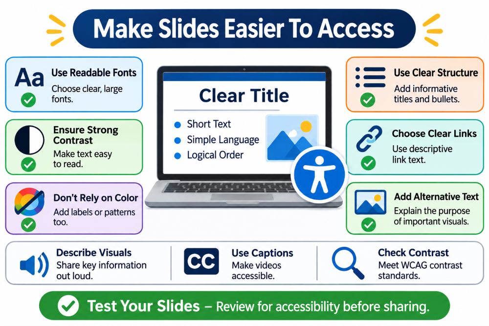
Accessible design improves the experience for people using screen readers, captions, magnification, mobile devices, or different viewing environments. Use meaningful slide titles, readable fonts, strong contrast, logical reading order, clear link text, and alternative text that explains the purpose of important visuals. The accessibility guidance for presentation files also recommends checking files for common barriers before sharing them.
Do not rely on color alone to communicate meaning. For a chart, combine color with labels, patterns, or direct annotations. Where text and background colors are close in tone, a contrast ratio check against the WCAG thresholds will show whether the combination is readable before anyone sees it on a projector. During live, remote, and hybrid sessions, describe important visual information aloud and ensure videos are captioned when possible. The practices for accessible presentations emphasize consistent design, limited slide text, and spoken explanations of visual content.
Use AI Without Losing Human Judgment
AI can help turn notes into an outline, suggest slide headlines, group related ideas, and offer alternate wording. It can reduce the time spent facing a blank page, but it cannot replace responsibility for the final deck.
Use a controlled workflow: provide verified notes, request a short outline, review the logic, draft the slides, apply your visual system, and then complete a human fact check and accessibility review. Check dates, sources, calculations, tone, and visual relevance. A polished draft can still be vague, inaccurate, or poorly suited to the audience.
Review The Deck Before Delivery
Use three review passes. First, check the message: does the story build toward a clear conclusion? Second, check the visuals: are spacing, alignment, contrast, and charts easy to read? Third, check delivery: test timing, speaker notes, transitions, media, and backup files.
When possible, view the deck on the laptop, projector, and mobile screen that resemble real viewing conditions. Ask someone unfamiliar with the topic to summarize the main point after a quick review. If they cannot, simplify the story or strengthen the slide headlines.
Common Questions About Better Slides
| Question | Answer |
|---|---|
| How Many Slides Should A Presentation Have? | There is no fixed number. Plan according to presentation time, topic complexity, and audience needs. Focus on one clear idea per slide. |
| Should Every Slide Use The Same Layout? | Maintain a consistent visual style, but vary layouts to suit comparisons, processes, charts, quotes, and recommendations. |
| What Makes A Slide Look Unprofessional? | Tiny text, poor contrast, inconsistent alignment, low-quality images, unlabeled charts, unsupported claims, and overcrowded slides. |
Final Checklist
- Can the audience identify the purpose within the first few slides?
- Does every slide communicate one main idea?
- Are headlines specific, readable, and useful?
- Do visuals clarify the message rather than decorate empty space?
- Are facts, dates, and sources verified?
- Can people with different access needs follow the content?
- Has the deck been rehearsed within the available time?
- Is the next step clear?
Clear presentation design is a form of clear thinking. A focused goal, simple structure, readable visuals, accessible choices, and careful review can turn a routine slide deck into a practical tool for learning, decisions, and action.
Disclaimer
This article is for general information and education only. The guidance here describes common practice in presentation design and does not constitute professional design, legal, or compliance advice. Accessibility obligations differ by country, sector, and organisation, and the authoritative requirements are set by the applicable standards and regulations rather than by any single article. Software features, menu locations, and tool names change between versions, so check the current documentation for whichever application you use. Anyone preparing material that must meet a formal accessibility standard should confirm the requirements with a qualified accessibility specialist or their own compliance team before publishing or presenting.