
Blog
Interfaces Are Changing How People See Online Platforms

Most people who play online games are used to clean menus, quick loading screens, and a layout that makes sense within seconds. That expectation did not come from gambling, it came from years of mobile gaming, storefronts, and multiplayer hubs that trained everyone to navigate quickly and make choices without friction. When something feels messy, players assume the product itself is messy.
That’s why some readers end up looking at casino platforms through a gaming lens. They are not comparing them like old betting sites but comparing them like any other app they use on a phone.
A useful reference point is The Sun’s roundup of the Top 20 online casinos in the UK. The guide ranks operators using its “Sun Factor” scoring, and the checklist will feel familiar if you review games for a living.
It looks at licensing and player safety, how easy the site is to use on mobile, the depth of the game catalogue, the value and clarity of promotions, and how quickly withdrawals are processed. It currently puts Casumo top overall for its design and range, then calls out specialists such as VideoSlots for slots, bet365 for live dealer tables, and Duelz for fast withdrawals. It also notes the recent UK rules that cap wagering requirements at 10x, which makes bonus terms easier to sanity-check.
The list is updated regularly, and every pick is presented as UK Gambling Commission licensed, with the basics like verification, secure payments, and responsible tools treated as non-negotiable. For a gamer, it reads more like a product comparison than a hype piece.
What is interesting for a gaming audience is not the list itself. It is how the list is organised. It treats the experience like a product you have to live with, not a one-time choice you make and forget. That framing helps you spot the difference between a slick skin and a genuinely well-run service.
How Reward Design Borrowed From Games Shows Up Everywhere
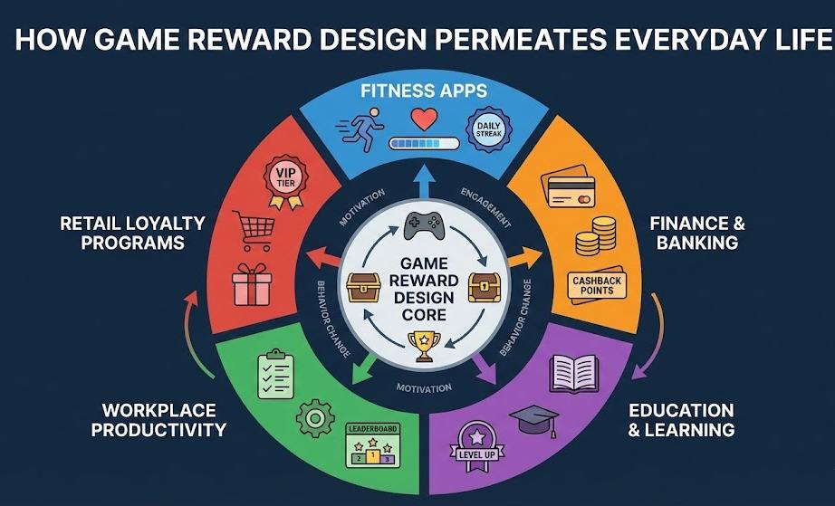
Casinos have leaned into mechanics that gamers already recognise. Loyalty tiers, missions, and timed events mirror the way seasonal content keeps players returning to a title. Some platforms use progression and achievement language that feels close to what you see in mobile games. The difference is that casino outcomes are probability-based, so the progression layer is about engagement rather than mastery.
This is where gamers need to keep their footing. A better dashboard does not change the odds. A more satisfying reward loop can still lead to more time spent inside the product. If you are used to grinding challenges in a game, it can feel normal to chase the next tier. In a casino context, that habit can turn into longer sessions without you noticing.
Why Trust Signals Now Look Like UI Choices
In gaming, trust is often built through small details. Is it easy to find settings? Are the rules clear? Do menus behave the same way every time? The same applies here. A platform that explains withdrawal rules cleanly and shows bonus terms in plain language feels safer than one that hides them behind tiny links. That is not because design equals honesty, but because poor design often travels with poor operations.
It also explains why player controls matter. Gamers are used to spending caps, account security prompts, and privacy settings. In UK gambling, tools like deposit limits and self-exclusion serve a similar role. If the platform makes those controls easy to locate, it signals that the operator expects users to manage their play rather than push them blindly.
Performance Is A Feature, Not A Detail
In browser gaming, performance is part of the experience. If a page lags, the player leaves. Casino platforms are now judged the same way. Load speed, clean navigation, and stability on mobile data matter as much as the game catalogue. Support and payments shape perception too. A platform that handles basic tasks smoothly feels more reliable than one that looks flashy but struggles with simple steps.
The wider internet set these standards. Many players move between titles, clips, and communities, so their patience is thin. Even something as ordinary as a games library shows what people expect from search, sorting, and fast previews. If a casino app cannot match that baseline, it will feel older than it really is.
If you come from a gaming background, you already know what good platforms feel like. Clear menus, stable performance, and reward systems that are easy to understand shape trust quickly. Casino sites are adopting those standards because they compete for the same attention. Enjoy the usability improvements, but stay clear-eyed about what remains unchanged underneath. The interface can feel more game-like, but probability still drives the outcomes.
How Player Support And Community Spaces Shape Confidence
Modern users rarely judge a platform by features alone. They also look at how quickly problems get solved and whether help feels human. Fast live chat, clear FAQ sections, and visible response times make a big difference to perceived reliability.
Gaming culture has trained people to expect active support channels, patch notes, and transparent updates. When a platform communicates clearly about downtime, payment delays, or rule changes, it builds the same kind of confidence players feel when a live-service game posts regular updates. Silence, on the other hand, feels like a warning sign.
Why Transparency Matters More Than Visual Polish
A polished interface can attract attention, but long-term trust comes from clarity. Players increasingly check how easy it is to understand bonus rules, withdrawal steps, identity verification, and limits before they even sign up.
Guides such as the roundup from The Sun emphasise factors like licensing under the UK Gambling Commission, along with usability, payment speed, and mobile stability. Operators frequently mentioned in such comparisons include Casumo, VideoSlots, bet365, and Duelz not simply for game variety, but for how clearly their systems function in everyday use.
For users, the takeaway is simple: if something takes effort to understand before joining, it will usually take even more effort once you are inside.
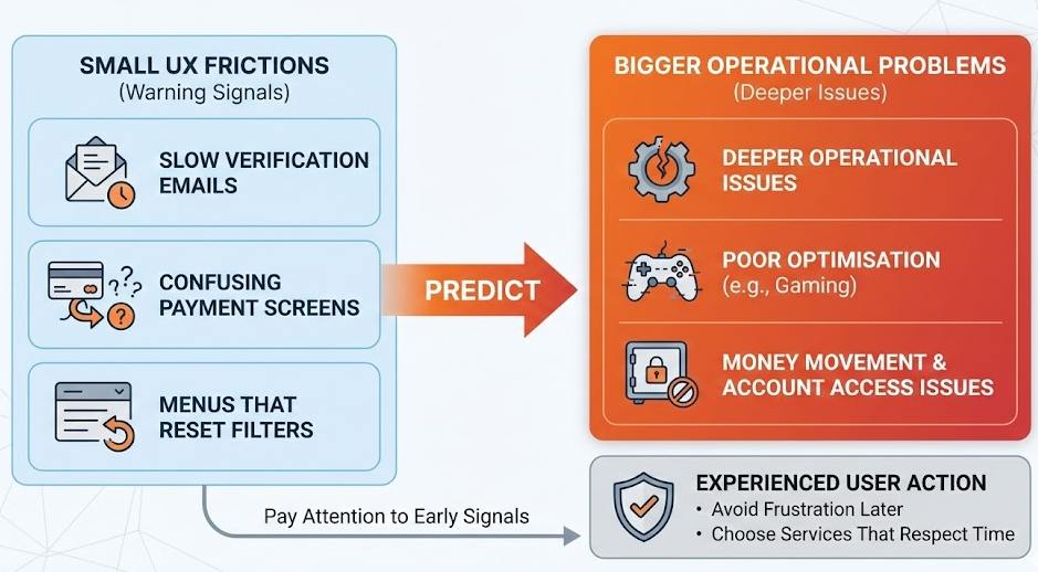
Small Frictions Often Predict Bigger Problems
Experienced internet users learn to watch for tiny warning signals. Slow verification emails, confusing payment screens, or menus that reset filters may look minor, but they often hint at deeper operational issues.
In gaming, these annoyances usually mean poor optimisation. In transactional platforms, they can affect money movement and account access. Paying attention to these early signals helps users avoid frustration later and choose services that respect their time.
Final Conclusion
Online platforms today are judged less by marketing promises and more by everyday usability. Clean navigation, stable performance, transparent rules, and responsive support now define whether a service feels trustworthy. Casino platforms are adopting the same design logic seen across mobile apps and multiplayer games because users bring those expectations everywhere they go.
For anyone coming from a gaming background, the lesson is straightforward. Appreciate the smoother interfaces and familiar reward structures, but remember that presentation improves convenience, not outcomes. A well-designed system can make participation easier, yet the underlying mechanics remain unchanged. Staying aware of that difference helps users enjoy modern usability without losing perspective.
Disclaimer
This content is for informational purposes only and does not promote or encourage gambling. Online gaming and casino activities involve financial risk and probability-based outcomes. Users should always review local regulations, use responsible-play tools, and participate only if it is legal in their jurisdiction.